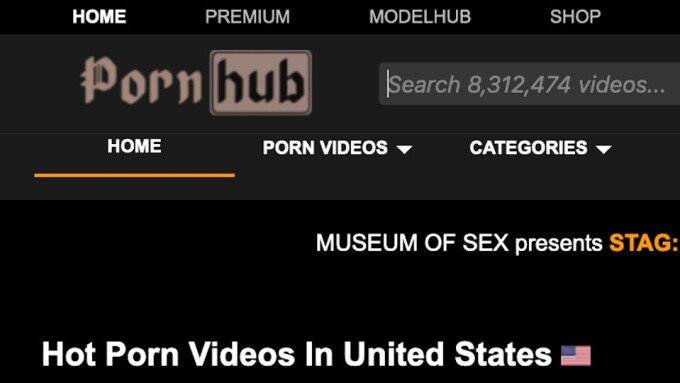
Update (Friday, June 7, 4 p.m.): Pornhub Aria, the tubesite official spokesperson, tweeted at us the explanation for the new logo:
This is to show the launch of our museum of sex exhibit, Stag, in June.
— Pornhub ARIA (@Pornhub) June 7, 2019
CYBERSPACE — Eagle-eyed web users noticed today that popular tubesite Pornhub had changed its logo to a much less modern-looking one.
The logo, with the kind of pre-Renaissance lettering known as “blackletter” or, more informally, as “Gothic,” replaced the usual orange-and-black, modernist logo that has become a worldwide brand.
Today’s brown-and-black logo is more typical of designs that in the popular imagination have to do with the Middle Ages, monasteries, manuscripts, early printed books, pre-WWII Germany, fantasy, heavy metal bands, goth culture, the occult and similar Hot Topic-friendly graphics.
It is unclear as of this writing why Pornhub decided to quietly switch logos today.


