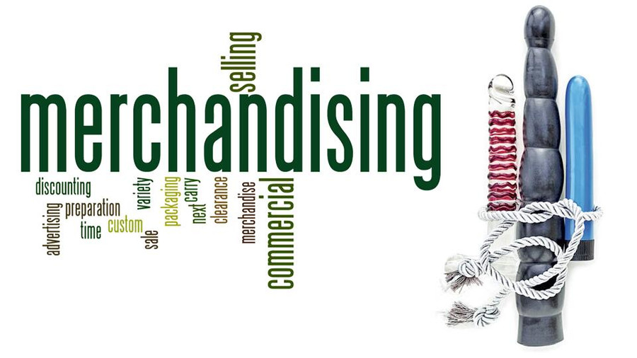
Merchandising.
In retail, this can be a dreaded word.
Merchandising is a lot like writing; ideas pop up, need to be explored, and there are a lot of rough drafts that just don’t work and have to be scrapped.
So much of a store’s business is dependent on how products are placed in the retail space, and for most businesses, how a store is merchandised is dictated by corporate guidelines — usually by someone who has never worked a day of retail in their lives.
In the adult industry, this is somewhat less true — especially in smaller companies that own only one or two storefronts.
I have the pleasure of working for one of those companies with only a couple of storefronts, and to me, merchandising is less a four-letter word (figuratively, of course) and more of an exercise in learning how to manifest my creativity in a visual manner.
When I first started working in my little store, my general manager would pop in to do floor resets. I would help, of course, in between waiting on customers, and listen intently as she explained what she was doing — because she was a busy person, and would have to leave sometimes partway through, and I wanted to make sure that I could pull off her vision.
Though I’ve worked retail before, there had always been strict guidelines in place — plan-o-grams from corporate, charts with everything laid out in neat little squares and circles that represented displays and products, posters and signs that were hauled out every year, at certain points of the year. In those businesses, new signage was a cause for “oohs” and “ahhs” and no fretting about where they would be displayed, because it was all neatly laid out for the grunts (i.e. sales clerks like me.)
Merchandising for my current store was almost a culture shock. I was more used to being told exactly where things were to go, with no room for flexibility or deviance; I used to have mental fits at not having those sorts of guidelines in place. Every week I’d hold my breath when our GM came in, hoping that I hadn’t messed up a display she asked me to finish. Every week I found myself breathing a little more easily when she praised my work — and even if I didn’t get it quite right, she would take the time to explain what she was envisioning in a warm, friendly manner, so it felt less like I screwed up, and more a lesson.
Which it was.
A lesson, I mean.
You could put a dong or a dildo on a table or shelf and call it done — or you can add some lube, or a massage oil, or a pretty piece of lingerie in a complementary color. Then you can tuck fake flowers, or Christmas balls, or a sparkly pumpkin among the products to draw the customer’s eye — then you have a display that pulls them in, makes them look, makes them want the story you’re creating for them.
Merchandising is a lot like writing; ideas pop up, need to be explored, and there are a lot of rough drafts that just don’t work and have to be scrapped. It’s one of the reasons I both love and hate this aspect of the business, but as a writer, I am used to the process. For me, merchandising is all about telling a story, not simply putting a product on a shelf and hoping it will sell. I want a customer to come into our store and be drawn in by our displays, seduced by the possibilities we lay out for them, create their own fantasy with our products and want to take them home and make the story their own.
Looking at it from that writerly point of view makes it easier to accept those times that a display isn’t working, or when my vision is hampered by a lack of space. Like editing a story, editing a display is probably one of my least favorite aspects of merchandising.
Big, corporate-owned businesses have strict guidelines for their store displays that don’t allow for deviation, yes, but they also take into account the size of their store, and what will fit where.
Our store is a bit oddly shaped, with corners and dips and drop-ceilings that need to be taken into account. We don’t have plan-o-grams to work off of, or someone in a corporate office somewhere who has figured out all the dimensions of the space and what will fit. There is a lot of trial and error involved in our merchandising; we have an idea and run with it, and most of the time we have to change our original design because it simply doesn’t fit the space. Or maybe what we see in our heads doesn’t actually look all that great in execution, and then it’s back to the drawing board. And when we get new products in — and we get new products in nearly every week — we have to rearrange everything all over again so everything fits. It can be incredibly frustrating, and some days it feels overwhelming.
But I don’t let it get me down — or at least, not for long.
I’ve been working at my store for more than two years, and I have a lot of leeway when it comes to how our store looks. I work directly with my store manager in merchandising the store, often without having to gain permission to move things around. I’m in a position now where I can let my vision unfold and take shape on the walls and tables and shelves, and my coworkers and I discuss our ideas freely and with confidence that our opinions and creativity is not only welcome, but encouraged.
Seeing a display come together and having customers comment on how nice it looks is one of the best feelings in the world, and makes all those hours spent arranging and rearranging the store worth every drop of sweat and every moment of frustration. I can’t speak for my coworkers or my boss, but seeing a customer smile when they walk in and enjoy the space, compliment me on how great it looks, and leave happy with their purchases (and thinking naughty thoughts of how they’ll use what they bought!) is why I love what I do. And even though I have my moments of frustration when a display isn’t working, those moments are fleeting, and readily eclipsed by the satisfaction of knowing that I’ve helped make our store look fantastic, and that our customers enjoy their time with us.


